- Feb 14, 2024
- UI/UX Design
- Amelia Dawson
- 0
You have seen many applications or products in the market, but some applications attract more users. It is because their User Interface and User Experience (UI/UX) are strong enough to make users discover their product or services in detail or buy in their next step. That’s why a UI/UX designer plays a vital role in product design, development, and branding.
In a world of digital products, where you are a UI designer, then it becomes your responsibility to create an interface that attracts users or customers. For creative visual elements, you have to work with different combinations of colors, typography, and imagery that can enhance the user experience.
Before you start designing, you need to understand the UI design principles for better and appealing visuals. After that, it will become a blueprint or a base for UX designers to create an application that looks beautiful and user-friendly for its customers.
Here is a comprehensive guide to learn more about UI design and its principles.
What is UI design?
Creating a UI design is how your application or a product is visually appealing to a user in the first approach. UI designs are the visuals that interact with the users in their buying journey. Such as buttons, icons, screens, search fields, slide bars, and overall style.
User Interface designing comes in different forms, such as:
Graphical User Interface (GUI)
It is the most common User Interface design that we usually see. Graphical User Interfaces consist of image or icon-based elements found in many devices, such as computers or smartphones. When users have to interact with these interfaces, they will need external devices such as a mouse and stylus, or they can simply touch the screen.
Voice-Enabled Interface
An interface that works with a user’s voice is known as a voice-enabled interface. One of the best examples of this interface is “Alexa” and “Siri” that you may have used. It eliminates the need to tap on the screen to move to the next page. A user can simply use its voice to navigate from menus to other sections of the screen.
Gesture-Based Interface
As the name itself suggests, it is the interface that works with the gestures or motions of a user. Augmented Reality (AR) and Virtual Reality (VR) are well-known examples of this User Interface design.
7 UI Design Principles: For better designing
UI design principles are the part of the UI design process that acts as a foundation for a successful UI design. Let’s discover the UI design principles that help in creating user interfaces that are more appealing to users.
Clarity
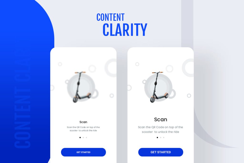
A good design is simple but attractive and intuitive. That’s why clarity is one of the basic UI design principles, which means you need to be clear with the approach. For instance, the button you have created should convey the meaning to the user before he clicks on it.
It is a game of a few seconds in which you can attract users or lose them. You can try creative buttons or icons to give a wow factor to your design, but there should be clarity in it. Otherwise, your users will get frustrated with their first approach. Therefore, avoiding unnecessary complexity in your design will make users stick to your product.
Consistency
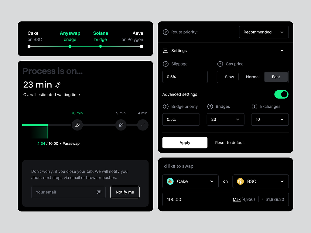
Consistency is the key element of the UI design principles. It means the fonts, colors, or anything you use should be consistent. So, when users have to do a new task, they have an understanding of all the visual elements and how they work. Such as which button they have to click to find the information they are looking for.
When your users get a sense of familiarity with your design, they will be able to do their tasks faster without any guidelines. You will be able to reach the goal easily and effectively when you reduce the learning curve in your design.
User Control
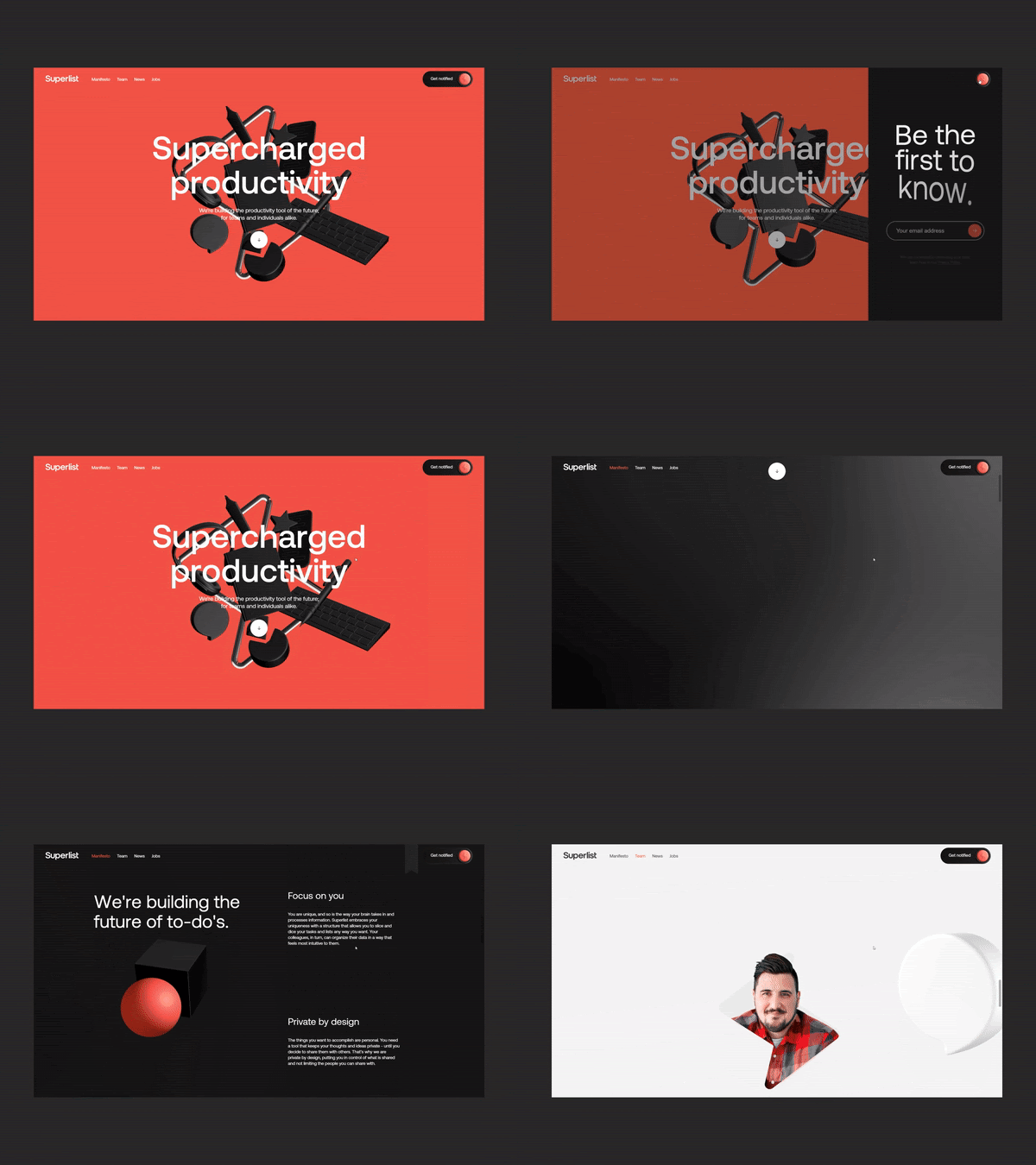
Another UI design principle that is essential for your product design is user control. It means that your design should have some elements that users can take during their buying process.
For instance, if you are creating a form, you should create a ‘back’ button instead of creating a button that eliminates the whole process. If a user has made a mistake in their previous step, then they have the option to return (one step back) and continue their form submission process.
When you minimize the confusion in your design, your users will be more engrossed in taking the specific actions they were looking for. One of the best examples is Tesla. It has eliminated the need to understand the heavy instructional guide to use its features and run the car; you can simply control your car via touch screens.
Visual Hierarchy

In UI design principles, you also have to look at the visual hierarchy. You have to design the elements of the page according to their importance. For example, you have to keep the most important elements at the top of the page, then the least important, and so on.
It is not just limited to the sections of the page but also the other things like;
- Size – Large elements grab the user’s attention more. That’s why the things you want to highlight should be bolder and bigger, such as headings and CTAs on your page.
- Fonts – You can use different font styles to create a better visual hierarchy, but make sure your message is easily readable and visible to your users.
- Colors – Bright colors attract the most, and you have to use them carefully at the places where you want to make your users take a specific action.
Accessibility
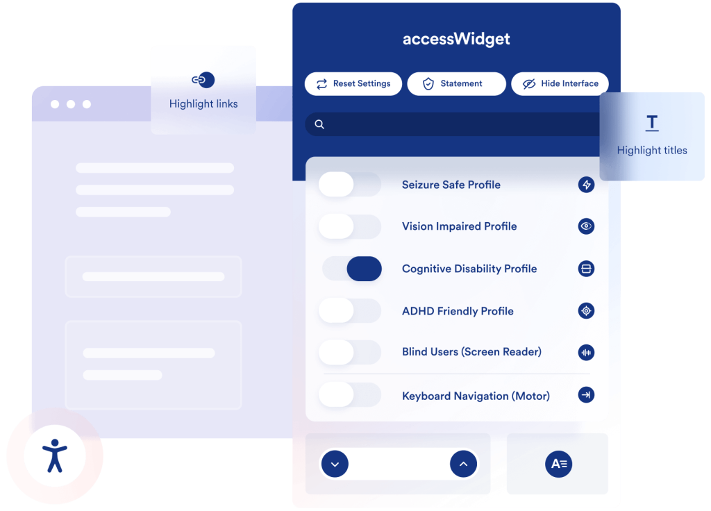
In the rules of UI design, you have to make a product easily accessible to everyone instead of focusing only on making it visually appealing. There are some people with vision impairments, and you need to make your product accessible to them as well.
While you are designing the product, use appropriate color contrasts, descriptive Alt images, and visual cues to make your product more accessible for all individuals. You can make your UI design keyboard-friendly as well so that users can navigate through the Tab keys.
Negative Space (or White Space)

In the rules of UI design, you have to make a product easily accessible to everyone instead of focusing only on making it visually appealing. There are some people with vision impairments, and you need to make your product accessible to them as well.
While designing the product, use appropriate color contrasts, descriptive Alt images, and visual cues to make your product more accessible for all individuals. You can also make your UI design keyboard-friendly so that users can navigate through the Tab keys.
Communicates Brand Value
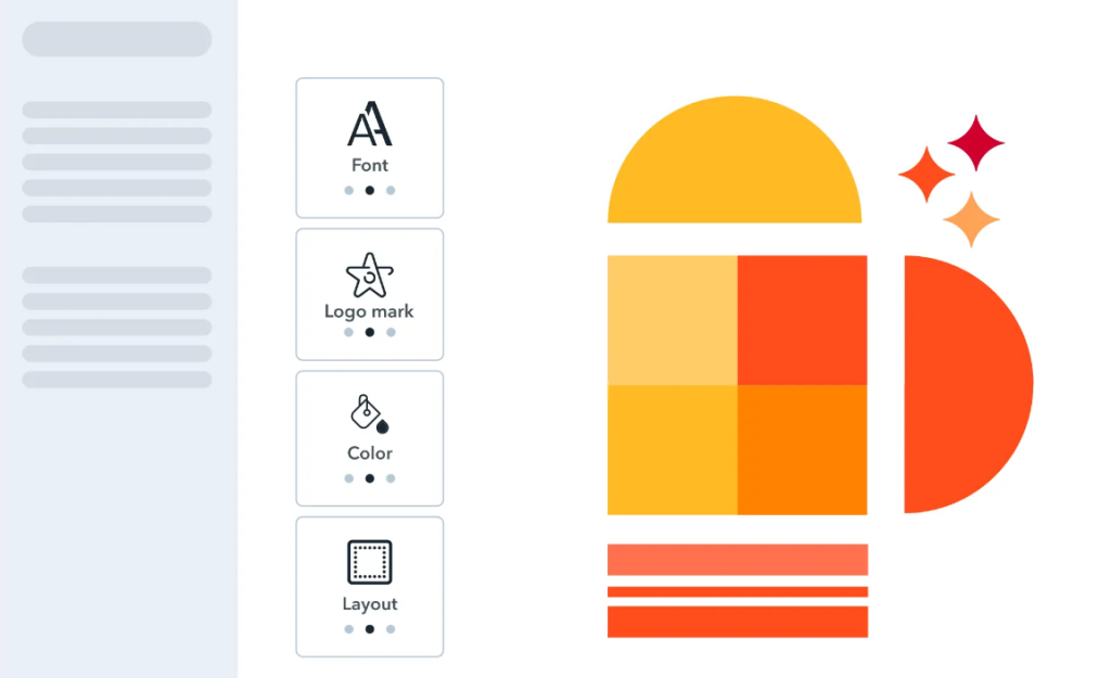
As a UI designer, it becomes your responsibility to design your visual elements to communicate the brand value of your product. It is among the basic UI design principles you need to know before designing. Creating branding in your UI will convey a unique brand story to your customers.
Elements like logos, colors, fonts, and images become a communication tool that can establish a recognizable brand identity. Your users will get a message from each section of a page.
Importance of UI design principles
UI design principles are the guidelines that UI designers can follow and use. It works like Google Maps, which helps you to reach your destination by suggesting the different ways to go, vehicles that will be available, distance, time, and busy areas like traffic.
Following UI design principles will help you build an application that fulfills the user’s expectations and enhances the user experience. Learn some more reasons to know why UI design principles matter in designing.

Satisfactory Experience
The principles of UI design help in designing an interface that creates a positive experience for users while they interact with your product. The UI design principles work as UI recommendations that you need for building an interface that is user-friendly, visually appealing, and consistent.
Improved Usability
Creating an easy-to-use interface is one of the principles of UI design. It helps your users to get the information easily without any hassle. Also, it helps the developers and QA team to check the usability issues quickly.
Better Consistency
In the principles of UI design, you have learned that interface elements have to be consistent. So that users can save their time and explore the other features of the product. The rate of user experience and engagement increases with the uniformity of your design.
Time-Saving & Money-Saving
For a longer time, you can save money and time by following the guide to UI/UX design. Plus, it will eliminate the need for costly modifications in your interface.
Higher conversion Rate
If your product is aesthetically appealing, user-friendly, easily accessible, and ensures the other principles of UI design, then it automatically makes the users take necessary actions. As a result, your users will turn into customers, and you will experience a higher conversion rate.
Conclusion
Whether you are learning a UI design or a UI designer, follow the UI design principles and UI design trends to create more alluring user interfaces for a product. TrooThemes is one of the platforms where you can see the various themes and layouts of the products. You can observe intuitive interfaces and advanced features in those themes, which are created by a skilled team of UI designers.


